UX/UI Design
Branding
Presentation
UX/UI
Strategy
ReminderX
back to UX/UI main pageOverview
Reminder X is an all-in-one productivity app that merges the essential functions of a calendar, reminder, and to-do list into a single, accessible experience. The goal was to design a platform that feels intuitive and effortless for users of all technical backgrounds, from young professionals to senior executives. Surprisingly, the main competitor wasn’t another digital tool but the traditional Post-it® note: over 90 percent of participants still relied on handwritten stickies to track daily tasks. The design challenge, therefore, was to create a digital alternative that matched the speed, familiarity, and reliability of pen and paper, while ensuring full WCAG compliance for accessibility.
The Research Experience
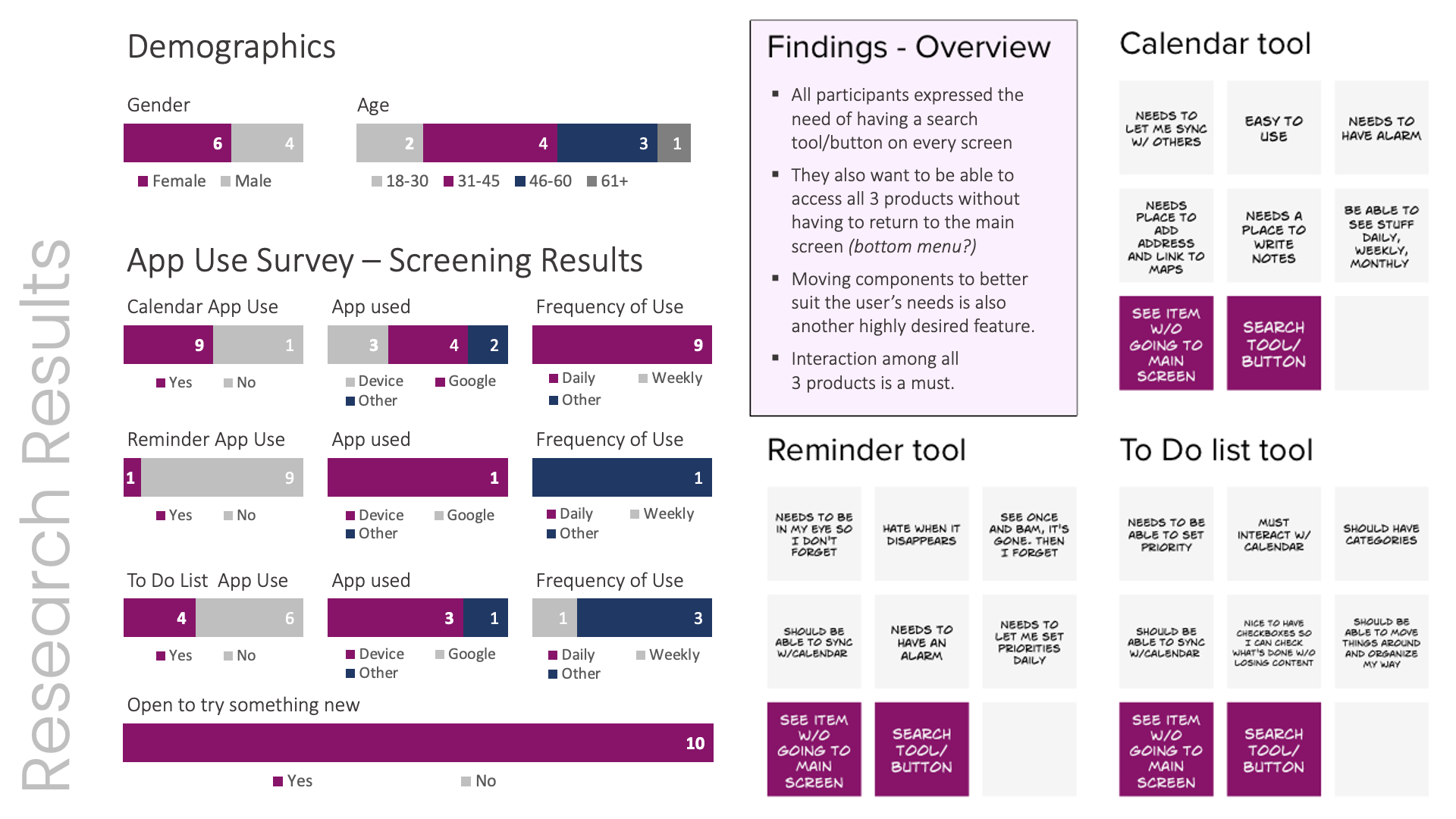
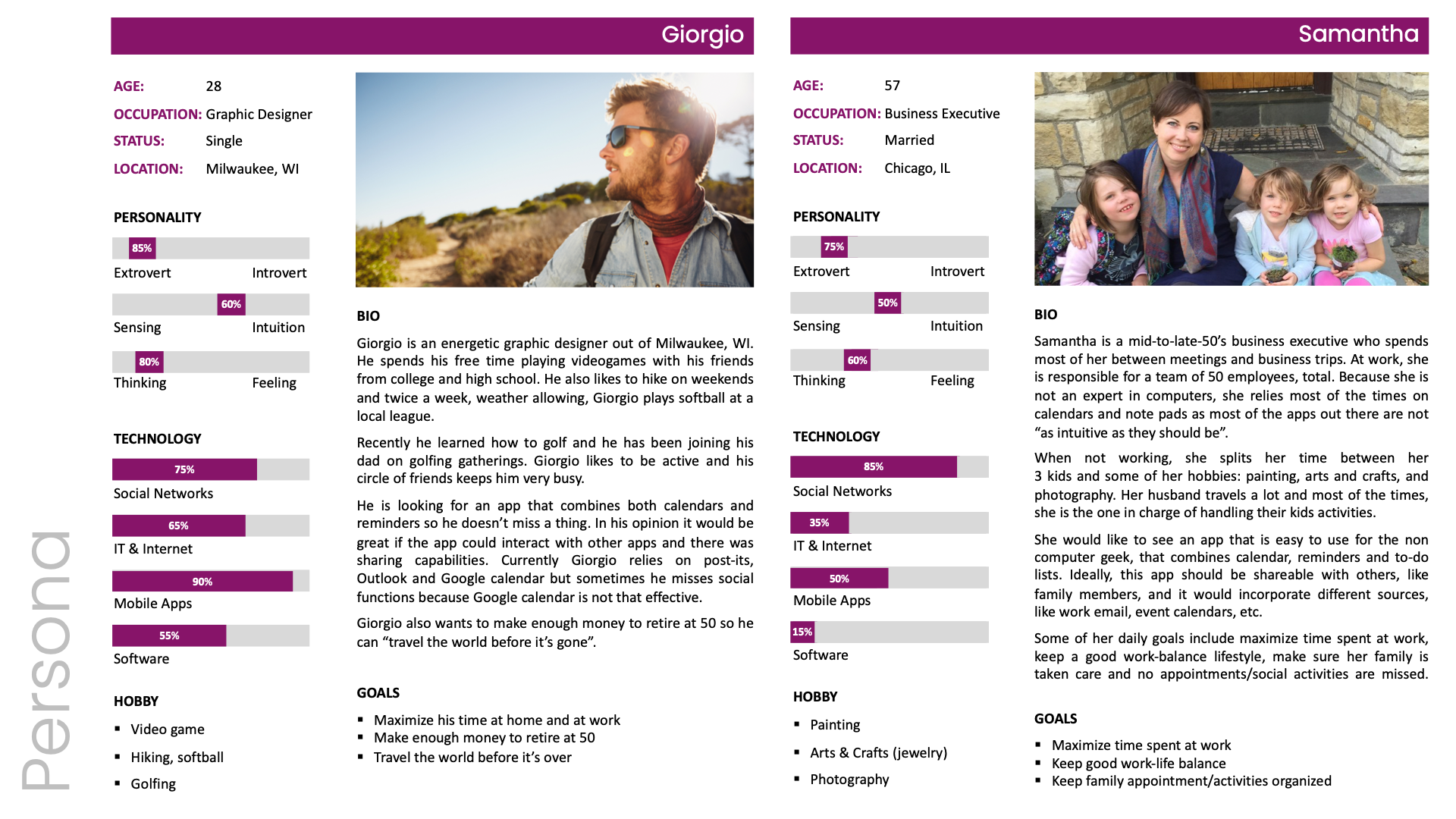
Over two weeks, ten participants from diverse age groups and professions were interviewed to understand daily habits and pain points related to task management. Nearly every participant admitted to depending on Post-its for reminders and lists. When asked why, half said it was simply faster, a quarter found that writing improved memory recall, and the remaining quarter viewed existing reminder apps as cumbersome or incomplete. These findings guided the early concept for Reminder X, an experience that needed to feel as instant and visible as a sticky note, yet as organized and integrated as an enterprise-level productivity tool.
Design Approach
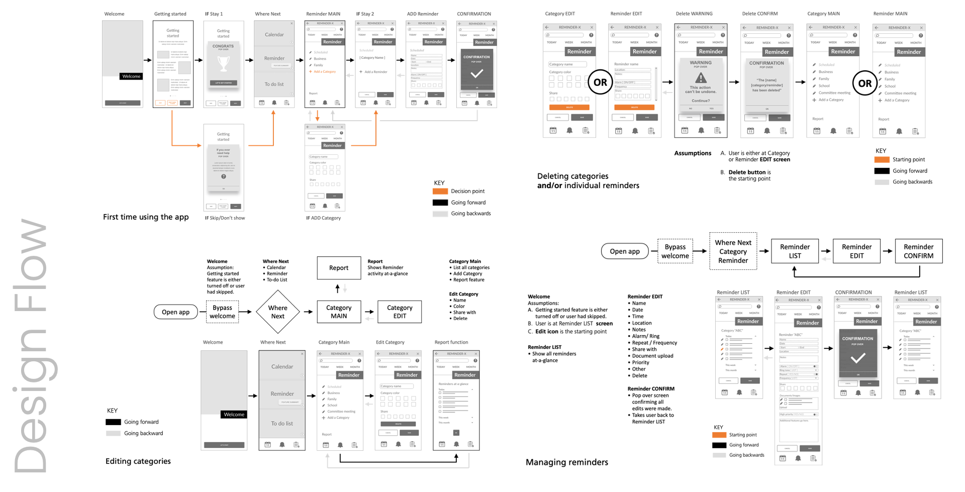
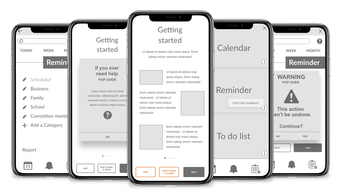
User interviews revealed a strong desire for continuous visibility and quick navigation. Participants wanted access to calendar, reminder, and list features on every screen, without repeatedly returning to the home page. They also expected universal access to search, help, and tips across all views. These insights informed the app’s structure, resulting in a design that emphasized contextual consistency, minimal navigation layers, and persistent utility icons. Wireframes were developed to test placement, readability, and cross-feature interactions, ultimately validating the need for a bottom navigation bar and centralized search.
Prototype Development
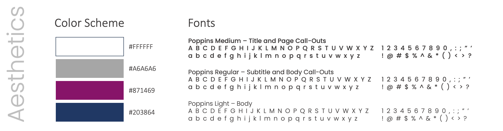
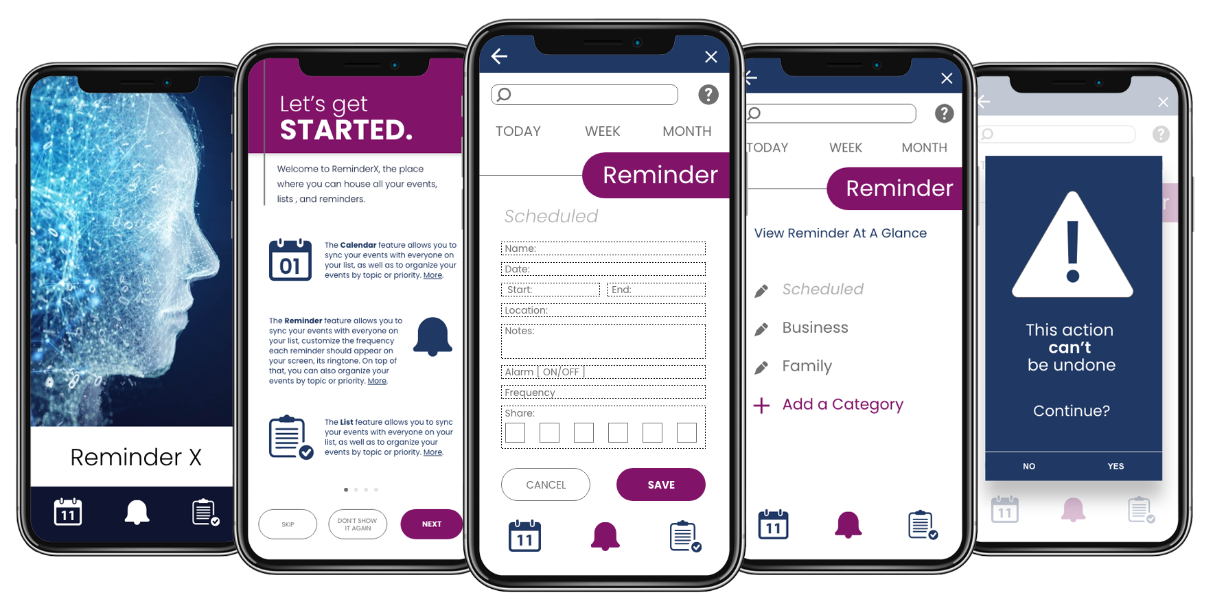
Once the research insights were synthesized, the prototype evolved into a clean, modern interface that balanced clarity with approachability. The design maximized white space to reduce visual clutter and used a deep blue for contrast in place of pure black, softening overall intensity. Accent colors (a warm purple and medium gray) provided hierarchy and personality without sacrificing legibility. Typography from the Poppins sans-serif family supported readability across screen sizes, while interactive elements were tested for contrast ratios and touch-target accessibility. The final prototype demonstrated a fresh yet familiar aesthetic, mirroring the tactile immediacy of a Post-it while delivering the efficiency of a smart digital system.
Lessons Learned
This project reinforced that usability must be grounded in habit, not novelty. Users didn’t want another app, they wanted a smarter version of what already worked for them. Early research highlighted the emotional connection people have with tangible reminders, shaping a design that felt trustworthy, visual, and friction-free. A key takeaway was that small interface details like visible search, persistent icons and confirmation messages, have an outsized impact on user confidence. The process also reaffirmed that accessibility is not an afterthought but a core component of inclusive design, ensuring every interaction feels natural to every user.