UX/UI Design
Branding
Presentation
UX/UI
Strategy
Meals On Wheels
back to UX/UI main page
Overview
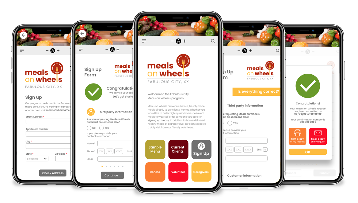
Meals on Wheels is a cross-platform, cloud-based application form that enables local residents to easily apply for meal delivery services. Given that the majority of users are adults over 75 years old, many with limited vision, mobility, or cognitive impairments, accessibility was the driving force behind every design decision. The goal was to create an experience that is WCAG-compliant, intuitive, and effortless to navigate, regardless of a user’s comfort level with technology.
The Research Experience
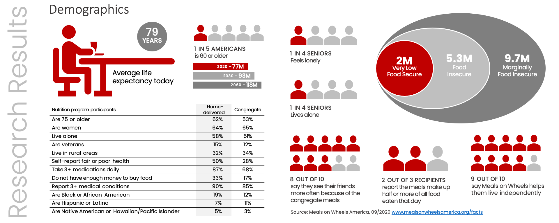
With a condensed project timeline, direct user interviews were not feasible. Instead, user demographics and behavioral insights were drawn from publicly available data on the Meals on Wheels America website. According to their findings, the target audience includes individuals aged 60 or older, or their spouses, who are at risk of malnutrition or unable to visit a local Meals on Wheels center for a meal. This foundational research helped define key design principles focused on clarity, accessibility, and emotional comfort, ensuring that the digital experience was not only functional but also empathetic to the challenges of aging and isolation.
Design Approach
Design decisions centered on two core pillars: accessibility and navigation.
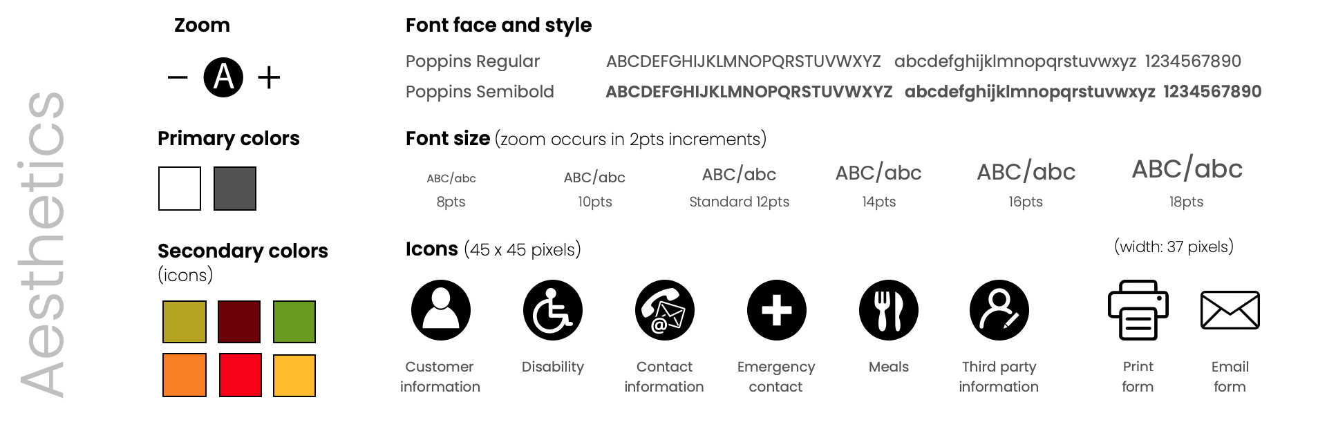
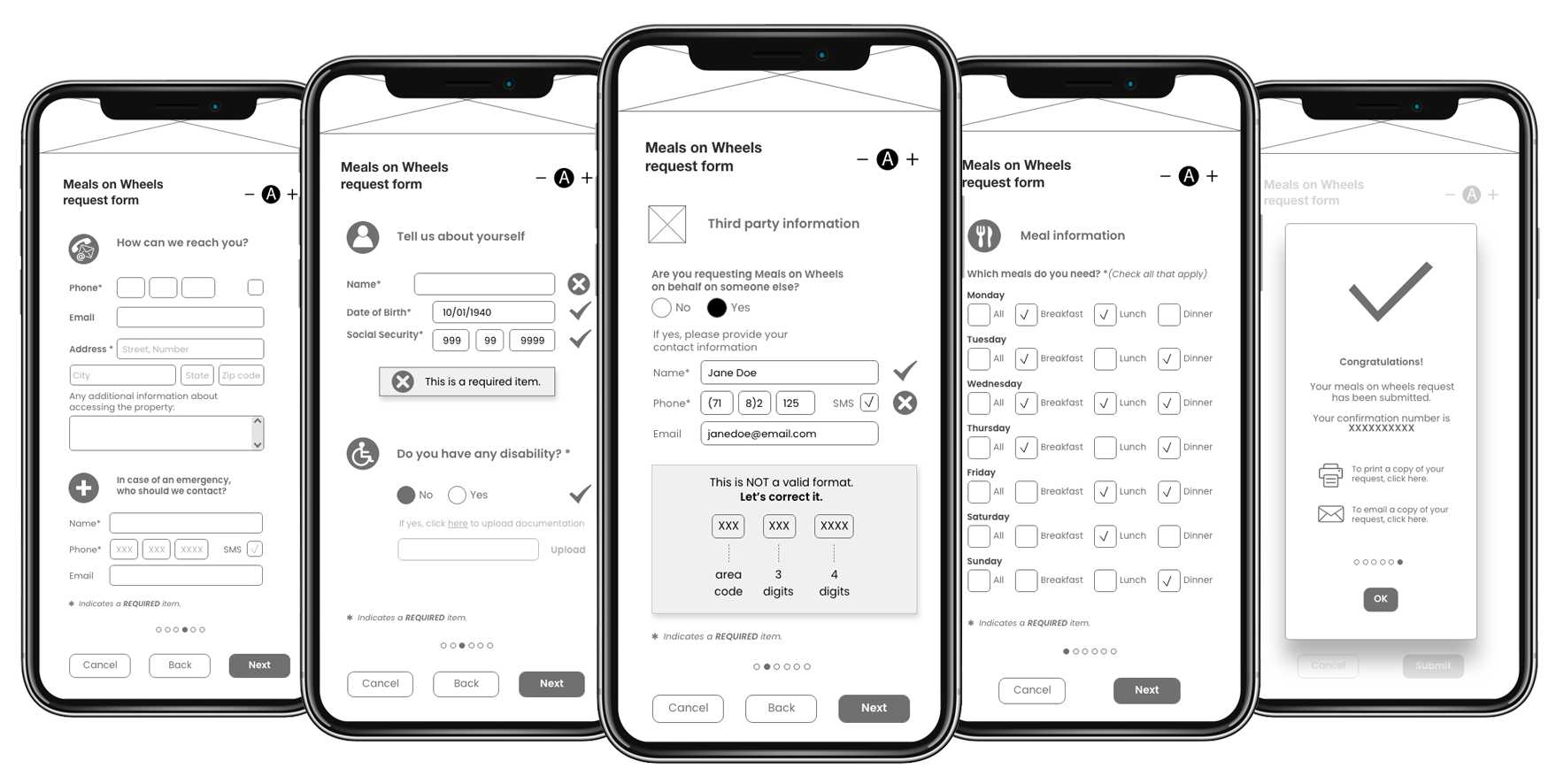
Accessibility was addressed through clear visual hierarchy, where main questions were displayed in a semi-bold style, while secondary text used regular weight. A 2-point typographic increment established readability and structure across form levels. Each category was color-coded following brand guidelines, and a zoom feature was integrated to support users with limited vision.
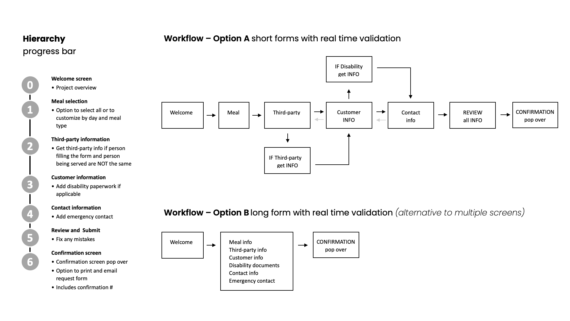
Navigation was designed for simplicity and predictability. The number of screens was minimized to reduce cognitive load. Required fields were clearly marked with an asterisk, and users were given the ability to move backward and forward through screens before submitting their application, promoting confidence and control.
Prototype Development
The visual design emphasized clarity, warmth, and trust. A predominantly white interface was paired with soft gray tones to reduce contrast strain. Accent colors included a rich maroon complemented by warm shades of yellow and green, evoking a sense of care and comfort. A sans-serif font family was chosen to maximize legibility across devices and screen sizes. The result was a clean, intuitive prototype that prioritized accessibility without sacrificing visual appeal, proof that inclusive design can be both functional and aesthetically engaging.
Lessons Learned
This project underscored the importance of empathy-driven design and the value of high-fidelity interactive prototypes. Being able to test and experience the form before development was essential for validating accessibility choices and user flow. More importantly, this project offered a powerful reminder of the challenges faced by elderly and disabled users, especially those living alone and navigating technology independently. It reinforced that thoughtful design isn’t just about usability; it’s about dignity, inclusion, and human connection.